Monday, April 26, 2010

Writing Project 3

Author's Note

This writing project has been the most difficult for me so far but also the one I consider the most enlightening. It took something I am unfamiliar with, art in the form of sculptures, and something I am uncomfortable with, the art of creating something for a public speaking purpose, and forced me to create something personal, which I was comfortable with.

When I first began observing SANDY, I was really afraid to make any sort of inferences because I did not feel qualified to judge art because of my unfamiliarity. But then I realized that Richard McDermott Miller did not make this sculpture to only be looked at by art experts. This made it easier for me to just take in what I was seeing and to formulate my ideas and opinions. Writing in my journal for each observation helped me to get my thoughts organized and I was in front of my sculpture actively looking at it instead of just thinking about it. I had some difficulty at first deciding what I actually thought about SANDY until I let go of inhibitions regarding not knowing enough and just moved around her, writing about everything that I thought at each point. This led me to the two perspectives that are so opposite to me that are the focus of my letter to her.

Writing the rough draft was also difficult for me because I wasn't quite sure what the assignment was asking for. I wasn't sure if I was supposed to be writing more from a rhetorical aspect just directed at my sculpture, or more personal and my own ideas speaking to the sculpture. After looking at examples from previous students, I hoped that I was right in combining the two, although I definitely made it personal because of how I felt about SANDY. In creating my rough draft, I did not really take into account the fact that I would also be performing the piece. When I read it out loud for my partner during peer reviews, I realized I needed to practice how I would be moving around my sculpture according to what part I will be discussing at each moment. I feel that I put each topic in not only the order that I originally thought through when observing SANDY, but also in a logical order for my presentation.

Peer reviewing gave me the opportunity to listen to how my letter would make sense when reading it out loud and I took this into account when I wrote my final draft. I added more details as to how I was thinking and feeling when moving far away and close up to SANDY in terms of how her body language was speaking to me. I also added more about how her material, bronze, was very important as to what an observer was taking from her. I feel that I better explained how the material and how marks and dents caused by her creation and the weather made me feel. I think I was too vague in my rough draft in addressing specific details that were the most important to me.

This writing project was challenging but it was the most interesting to me to overcome, and I am glad I had the opportunity to look at art in this way.

Rough Draft

Statement of Purpose

Writing Project 3

Dear SANDY,

I speak to you now as a friend, as the time we have spent together that has now spanned several weeks has brought me closer to you, literally and figuratively. When we first met, I was cautious. I did not open myself up to you as I should have, perhaps because you are set back from our world. I wonder how many people have passed by and simply gave up trying to see the real you because of this box you have been placed in. But I did not give up. At first I stood far away from you, trying to see some big picture of how you fit in this sculpture garden at the Sheldon Art Museum. But that's not what you are meant for. Your creator, Richard McDermott Miller, did not make you so you would fit anywhere because you, my friend, are trapped in defined space. You are not of the natural world that you are placed in, among trees and grass, because you are made of bronze. You are not even from our time; you are from a world of gender wars of the year 1967 that has very obviously trapped you. This I could see, even from far away. But your features are undefined; your body is plain and not unique from this viewpoint. As I moved around you, I began to see different parts of your construction. I saw how your body language seems to change as my perspective changed.
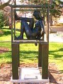
When I saw you from the front of your framing, I thought you were a sad and almost pathetic individual. All I saw from this perspective was that you are conforming to your entrapment; you have given up fighting and your face speaks of defeat. From this distance, the bronze of your construction does not appear affected by anything except the way the light shines on it from the sun. Your body thus appears the same as the frames around you, other than the curved nature of your body in opposition to the straight nature of the boxes.

When I moved closer to you I could see your face and how it works with your body. Your head, to me, seems to be turned down in weakness. I begin to wonder if you have even tried to fight this, because from where I stand you are encapsulated in two boxes; one of your own doing and one that is imposing itself upon you. As I said before, they are so different from the form of your body and they are geometric. But you seem to be resting, defeated, in the first frame that traps you. Your hand is hanging down, which indicates that it is possible to reach out of this space, but that is all you have succeeded to do. Your plight is of your own sadness and wrongdoing, or so it seems from this viewpoint. Seeing you close up from this perspective almost disappoints me and your flaws and scars are disheartening. Some of the marks and dents in your body are simply a part of how your body was formed in its creation, and are what make you human. But there are also flaws that have been created by the weather, as you have spent most of your life outdoor. They stand out to make you appear weaker, especially in comparison to the smooth, polished finish of the frames that have been able to withstand weather damage when you couldn't.
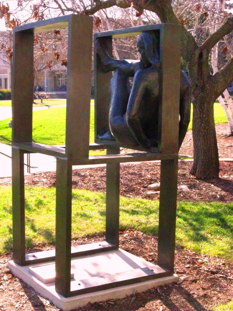
Still remaining cautious of becoming close to you, I stepped behind your construction and was astonished by the change that overtook you and the way I saw you, even from a distance. I could see that you had grown stronger, that you had changed and your body language is communicating something completely differently. Your back is arched in pushing against the frame that is trapping you. Your fluid, strong legs are contorting because of your choice, not defeat, against this stiff, geometric shape that is keeping you in its hold.
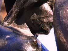
I move closer to you, to learn from this strong creature. I see your face even clearer and know that it is set in determination to win, not in defeat as it seemed before. I see your hands and feet that are large in proportion to the rest of your body and are overcompensating of your efforts to show how strong you are. Your legs and arms are obviously muscular by the way they are shaped and are straining against the frame that is touching you. I see how your body twists and fights while accepting the scars and flaws that you must take on. From here, I can see how a lot of the marks that you have taken on from your creation and from the weather does not take away from your strength; it actually adds to it because you are still fighting even with this damage. This vision makes me proud and I want to cry from seeing your efforts so defensively strong. I touch my hand to yours, hoping I can share the strength you are showing. It seems this is the support you need, because you are even stronger when I stand next to you. As a woman, I feel connected by this and the history of strong women in my family, who battled oppression in the form of Nazis, depression, and divorce, speaks to the history of the oppression against women that you have faced in the year of your creation, 1967.

SANDY, I can only hope that you will keep fighting and will not give up. I can only hope that others who see you will recognize the strength and determination I see in you and that they will not pass you by as another woman who will not or cannot fight. I can only hope that you feel the same way as I do and that you will remember me when I visit you for strength and reassurance. Thank you for all that you have taught me and for your perseverance.

Your friend, admirer, and fellow fighter,

Sarah Michelle Gilchrist

Wednesday, April 21, 2010

WP 3: Rough Draft 1

Dear SANDY,


I speak to you now as a friend, as the time we have spent together that has now spanned several weeks has brought us together. When we first met, I was cautious. I did not open myself up to you as I should have, perhaps because you are set back from our world. I wonder how many people have passed by and simply gave up trying to see the real you because of this box you have been placed in. But I did not give up. At first I stood far away from you, trying to see some big picture of how you fit in this sculpture garden. But that's not what you are meant for. Your creator, Richard McDermott Miller, did not make you so you would fit anywhere because you, my friend, are trapped in defined space. You are a woman who has been trapped by your world of gender wars. This I could see, even from far away. But your features are undefined, your body is plain and not unique from this viewpoint. As I moved around you, I began to see different parts of your construction. I saw how your body language seems to change as my perspective changed.

When I saw you from the front of your framing, I thought you were a sad and almost pathetic individual. All I saw from this perspective was that you are conforming to your entrapment; you have given up fighting and your face speaks of defeat. When I moved closer to you I could see this as well, your head is turned down in weakness. I begin to wonder if you have even tried to fight this, because from where I stand you are encapsulated in two boxes; one of your own doing and one that is imposing itself upon you. Your plight is of your own sadness and wrongdoing, or so it seems from this viewpoint. Seeing you close up from this perspective almost disappoints me and your flaws and scars are disheartening. They stand out to make you appear weaker.

When I was still remaining cautious of becoming close to you I stepped behind your construction and was astonished by the change I saw. Even from a distance, I could tell that you had grown stronger, that you have changed. Your back is arched in pushing against what is trapping you. Your fluid, strong legs are contorting against this stiff, geometric shape that is keeping you in its hold. I move closer to you, to learn from this strong creature. I see your face set in determination to win. I see your hands and feet, overcompensating of your efforts to show how strong you are. I see how your body twists and fights while accepting the scars and flaws that you must take on. This vision makes me proud and want to cry from seeing your efforts so defensively strong. I touch my hand to yours, hoping I can share the strength you are showing. It seems this is the support you need, because you are even stronger when I stand next to you. As a woman, I feel connected by this and the history of strong women in my family, who battled everything from Nazis to depression to divorce, speaks to the history of the oppression you have faced in the year of your creation, 1967.

SANDY, I can only hope that you will keep fighting and will not give up. I can only hope that others who see you will recognize the strength and determination I see in you and that they will not pass you by as another woman who will not or cannot fight. I can only hope that you feel the same way as I do and that you will remember me when I visit you for strength and reassurance. Thank you for all that you have taught me and for your perseverance.

Monday, April 19, 2010

WP3: Statement of Purpose

This writing project has been the most difficult in terms of preparation for me because of the object and the analysis of the object. I am not very familiar with art especially in sculpture form but this class has prepared me for the rhetorical analysis that I have been working with in observing my sculpture.

The object I am analyzing is different from other writing projects and the requirements for this project are different which has affected the context and slightly affected my audience. I will still be publishing my writing in a blog post in a form similar to others with images and hyper-links and such. However, because I am doing option 2, my project will take the form of a letter to my sculpture which is quite an altered context from before because my writing will not be directed at the same audience of other writing projects. Additionally I will be reading my letter to my sculpture in front of the class and we will be outside. This is a whole new environment for the presentation of my writing and will be an interesting alternative to what we have done before.

As I mentioned before, the audience of this writing project has changed because of the requirements of option 2. The letter I am writing is specifically directed at my sculpture, because I will be using words like you to direct it such, and so she is my primary audience. Also this project will be available in two ways to my secondary audiences; I will be reading my letter to my sculpture in front of the class and also posting in a blog. My secondary audience that are my classmates will hear my letter and have access to it on my blog. Other people who come across my blog will be able to read my letter but it will be a different experience. Also, people who come across my blog who aren't aware of what the parameters for the assignment were might by slightly confused at first by the form of the blog post. Perhaps my author's statement that will appear before it will make it more clear to those people and just anyone who is not clear on my purpose.

My sense of purpose for this writing project stems from the requirements of option 2. I believe I would feel differently about this project if I were doing just a rhetorically analytic essay. However I am writing a letter to my sculpture, who I have spent a considerable amount of time with, which feels more personal and has changed what I want to do with my writing. I want to communicate how SANDY makes me feel and how the aspects of her construction and creation work to make me feel these things. Even though I know she won't actually be able to hear me and respond or anything, it is still important to me that I communicate specifically to her without worrying about what makes most sense to everyone else because they aren't my primary audience. I want to most effectively communicate how rhetorical elements can be applied to the way SANDY is sculpted in a way that is personal to her.

Saturday, April 17, 2010

WP3: Pre-Writing 4

When looking at SANDY, I have greatly taken into account the year that the sculpture was created because of the historical context. SANDY was created in 1967 which was a tumultuous time in American history with the civil rights movement going strong. I thought of this fact as soon as I saw that date and took note that SANDY is very obviously a woman. Historians attribute the beginning of the women's movement with the women's rights convention in July of 1948 at Seneca Falls (Timeline of Events). However, most people think of the 1960s and 1970s in the United States when they think about women's rights. In 1967, it had been a year since Betty Friedan founded the National Organization for Women and women had seen some victories such as the Civil Rights Act and other laws that banned discrimination based on race, sex, and gender. Betty Friedan's book The Feminine Mystique in 1963 opened most of the country's eyes to the narrow role that they had put women in and how women felt about this. Even with laws and national awareness of the subject, women would continue to fight through the seventies for their rights to be who they wanted to be, not trapped in what society wanted them to be(Women's History in America). This historical context is extremely pertinent to the creation of SANDY.

The sculptor's own work provides some context to work with when thinking about SANDY. Miller mostly worked with nude models to create wax and clay sculptures that he later cast into bronze. After working with abstract concepts he delved into the world of the art of human form and thus came the nude work. He also thought of the human body as geometric forms put together and incorporated this into his work, which we can see he expanded upon this outside of the human body with the boxes around SANDY and with the positioning of her legs. This will also be an important concept to think about when I develop my statement of purpose and writing project.

Works Cited:

"Richard Miller - Artist, Art - Richard McDermott Miller." AskART - Art Prices, Painting Value, Art Appraisal, Art Values, Auction Prices. Web. 18 Apr. 2010. .
"WIC - Women's History in America." Welcome to WIC - Breaking News and Opinion, Womem. Web. 18 Apr. 2010. .
"Women's Rights Movement in the U.S.: Timeline of Events (1848-1920) — Infoplease.com." Infoplease: Encyclopedia, Almanac, Atlas, Biographies, Dictionary, Thesaurus. Free Online Reference, Research & Homework Help. — Infoplease.com. Web. 18 Apr. 2010. .

Wednesday, April 14, 2010

WP3: Pre-Writing 3

After further observing SANDY, I have thought more about the material that she is made of and what that does in this particular form of communication. She is made of bronze which until now I did not understand the long process that it takes to use bronze as a material. From my understanding, the artist must first create a mold and use wax and other materials to form the details that they wish to incorporate and then use molten bronze alloy material over the mold. This is interesting when looking at SANDY because she is not incredibly, intricately detailed but this only makes the details in her face, body, and legs stand out. For example, her eyes and her mouth to me are the most important features of her face that communicate her demeanor. Also, the features in her arms and legs stand out because they are what give her the appearance of being strong.

The material of bronze is one that can be affected by weather and can be altered in its creation stage to look as if it has already been affected by weather. This alteration is a film of color change that is called a patina. Overall, SANDY seems to be a consistent color overall, and I am not knowledgeable enough in this material to say how much she has been affected by weathering because I do not know what she originally looked like. However, I did notice some swathes and patches of greener color in places that it would be beneficial for me to inspect further.

Bronze as a material has allowed the artist to create a sculpture that speaks the most through the physical positions of the different parts of the sculpture and allows this to be the focus. The details that stand out are those that the artist deemed most important to and I think the material made this possible.

Monday, April 12, 2010

WP3: Pre-Writing 2

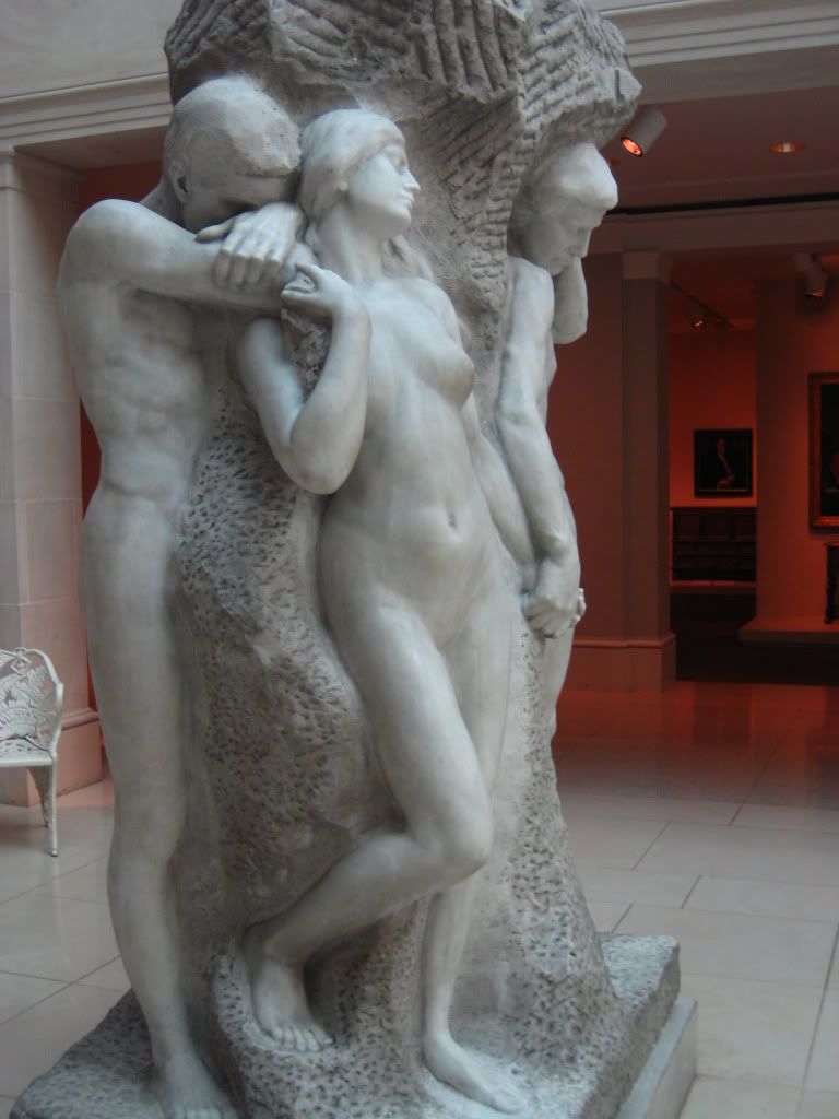
The sculpture I have chosen is SANDY: in Defined Space by Richard McDermott Miller of the year 1967. This sculpture captured my attention because of the way the sculpture functions from many different perspectives of the viewer. This is provided by the fact that the woman is captured within a cube that is formed by the frames that directly surround her and also seem to surround her, depending on the perspective of the viewer.

Logos is employed through this alternative perspectives because it seems to me that there are also different visual hierarchies for each perspective. Looking at the sculpture from directly in the front is interesting because of the way the two box frames work together. The one closer to the viewer appears larger and then encapsulated in that is the second frame, which itself encapsulates SANDY. This puts the focus directly on her and on the state that she is in. This seems to emphasize the trapped feeling of the sculpture.

When looking at her head on, as if I am making eye contact with her, I found that the detail that is provided in her facial expression and demeanor is somewhat lost when looking from further away. Her eyes are almost closed and her other body language makes it seem like it's from exhaustion. Her mouth is set in a way that could be interpreted as either in defiance or in defeat. Her shoulders are slumped and her body is caving in on itself because of the fact that she is trapped in a box. This arrangement speaks to the title of the piece of Defined Space. The arrangement of her legs seems to be set in a way that she is either trying to fight back or just in a position that would be the most comfortable in dealing with the fact that she is trapped.

I feel that the ambiguity in how you can interpret her body language is an appeal to pathos because of what I believe the sculpture is about. The first thing I thought of was the struggle of women against society because the fact that SANDY is a woman is obviously defined and detailed. I think Miller made this clear because of this. Thus, the ambiguity of her body language interpretation is almost an analogy for the different reactions of women to the oppression that society has imposed on them. Some women fight back and want to get out of the box. Some women give up the fight and are in a state of defeat.

I also find it curious that her hands and feet seem to be large in proportion to the rest of her body. They are what seem powerful about her in addition to her legs and arms that also seem strong. However she cannot show her strength because of the fact that she is trapped, and her legs, as previously mentioned, are a source of interpretation of what she is doing because of their position. I look forward to further examining SANDY so that I can further establish how I myself interpret her position and body language in relation to her situation of being trapped.

Wednesday, April 7, 2010

WP3: Pre-Writing 1


My experience with art objects has been limited to hands-on experience in art class from third grade until eighth grade and the small number of art museums that I have visited in my life including the Joslyn Art Museum in Omaha, the National Gallery in London, the Smithsonian in Washington D.C., and most recently the Art Institute in Chicago. In art class in elementary school, we worked with several mediums like clay, paper mache, and other typical materials for young kids. I don't really consider this any real experience with creating art because I was only just learning about basic art principles but wasn't applying them in creating the little clay animal sculptures or paper mache masks.

My visits to art museums have always been very enjoyable to me and I wish I knew more about what I see and more about art history. When I visited the National Gallery in London, I was only in the third grade so I don't think I was able to appreciate it as much as I would now. My most recent museum visit to the Art Institute in February exposed me to many different mediums like painting, paper drawings, sculptures and statues. Also, their exhibits are divided into countries of origin with quite an extensive collection of Greek art, as shown in the picture I took that I've included.

However, I don't know really know anything about art techniques and principles and I think this will affect how I approach this writing project. I plan on researching more about sculpture techniques, history, reasons for using certain mediums, and other pertinent information. I want to do this to not only be able to look at my sculpture with the best base of knowledge, but also because I want to learn more about art for myself and for future art visits.

Monday, April 5, 2010

Writing Project 2

Author's Note

This writing project proved to be more difficult than I originally thought. Upon researching and learning more about actual comics and their properties, I began to realize that there are many aspects of comics that had failed to register in my eyes. When picking a comic, I opted for a more serious one that also happened to not be an animation of something. I felt drawn to this particular comic because of the message it is getting across because it's something I've been working with as part of my way of thinking for a large part of my life. I also like the way photography is used as a background in the A Softer World Comics and found the other comics to be thought provoking and entertaining.

My first draft was not as organized due to the fact that I had not quite sorted out in my head what I wanted to focus on primarily and how to best organize it. I originally planned on discussing each panel individually, one section about framing and one about logos through word choice and then wrapping up with time progression. However the first peer review provided me with a better idea of discussing each element one section at a time but further dividing that up into sections about each paragraph.

My second draft attempted to do this but I was able to develop it even better in the final draft. For example, in my introduction I state "the comic employs the rhetorical appeal of logos through the word choice, the technical element of framing, and the appeal to pathos in the representation of time progression" in an order that I felt best explained the importance of each element. When I began discussing the logos through word choice, I followed the order of the panels to make the most logical sense. I elaborated on the third panel and discussed how word choice was further implemented in this panel.

In my section about framing, I feel I was more specific about how framing in each panel functioned as a focusing tool. For example, I state that "similarly, the third panel is framed that it only shows one object next to the words. As in panel two, this brings the focus to the words." This was important to what I was writing because I was trying to emphasize the relationship that persists over the progression of all of the panels.

In my revisions for the final draft, I also rethought exactly what I was trying to get across about the element of time progression throught the comic. I feel I better pinpointed this when I clarified that "The aspects of word choice and framing that are developed through the comic work together to create the representation of time progression, which in itself is an appeal to both logos and pathos." Throughout that paragraph I try to explain that this is what all the elements I had previously discussed are culminating to and working together to create throughout the comic.

As for the technical aspects of my essay, I improved the aesthetic of the photgraphs by figuring out that my laptop does not let me resize the pictures for some reason and fixed this. I also fixed the problem that some of my paragraphs were unevenly spaced and some of the font became ghosted by typing the entire final draft in the Edit Html mode using the basic html functions that my father showed me how to do shortly before I finished this final draft of writing project 2.

Rough Draft 2

Rough Draft 1

Statement of Purpose

Writing Project 2

Traveling carnivals are a part of an American summer tradition that many people are familiar with. The modern carnival has undergone evolutions and transformations since the debut of the amusement park at the Chicago World's Fair of 1893 (Amusement Parks). The first traveling carnivals developed a bad reputation because of the shady nature of many of their workers, the exhibits themselves, and the nature of society at the time to judge what was not up to certain standards (Traveling Carnivals). However, after the first Chicago World's Fair that introduced amusement park rides, carnivals began to change. They started to drop the less delightful aspects of freak shows and other adverse exhibits and added more fun rides from the amusement parks. This has developed to the common traveling carnival of today that evokes the feeling of letting go and enjoying the moment with adrenaline-rush inducing rides, deep fried foods, and arcade games that have a limited chance of winning but you do it anyways.

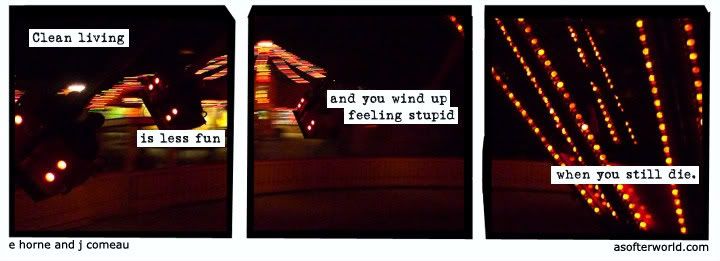
The associations of these feelings with carnival attractions are thus elicited when viewing images of such rides. The comic "I've been waiting," from the A Softer World collection by Emily Horne and Joey Comeau, uses this image paired with the statement "clean living is less fun and you wind up feeling stupid when you still die." The comic is commenting on the fact that life ends no matter what route one takes and it should be enjoyed. This is most effectively brought about by the relationship between the image of the carnival ride as the background and the words that are spread across the panels. To establish this relationship, the comic employs the rhetorical appeal of logos through the word choice, the technical element of framing, and the appeal to pathos in the representation of time progression that is developed through the aforementioned two. It is important to investigate each panel individually and then explore their final congruence in the same manner as one reads a comic.

In accordance with this separation of the photograph that contains certain representations for each panel, there is a separation of the words across the comic. As with the aspect of observing each panel separately, the observer of the comic also reads each statement on its own and processes it that way, and then evaluates the entire sentence at the end. The first panel contains the statement "clean living is less fun" that is itself split in half at the top and bottom of panel which are processed by the reader individually as well. The reader begins by developing what clean living means to them by examples in their own life or what they see in other people's lives. This may have a positive connotation at first because most people don't want to live a dirty or polluted life. However, the next statement to be processed, that it is less fun, changes the tone to the reader. They begin to rethink what clean living means and why it isn't always a good idea. This is an appeal to logos because of the way it changes the cognition of the reader.

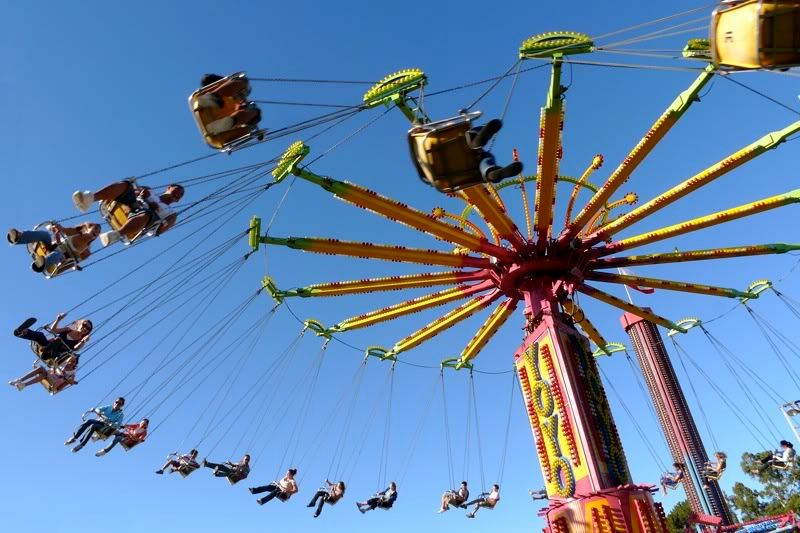
The second panel further employs logos to change the cognition of the reader. The writing is not separated within the panel like the first one. The reader processes the statement in its whole which is further pushing the idea that clean living is not as good of an idea as originally thought. The word choice is important in this statement because of the appeal to logos in the form of word play and because of further change in tone. The words 'wind up' are a play on words referring to not only the image in the background but also due to the nature of life. The image is of a carnival ride that is known as the Yo-Yo and the rider sits in a cart that is spun slowly around the center spindle until centrifugal force brings them almost parallel to the ground and then slowly back to the original position. The rider simply goes in a circle and doesn't actually get anywhere in the sense that they return to the same place except with an altered equilibrium. With the word play on 'wind up' the comic is thus implying that with clean living, one lives life without getting anywhere but returning with an altered state of mind, that of stupidity. Using this word drastically alters the tone of the comic because of its harsh nature that is incongruous with the beginning vocabulary. This is an appeal to logos because of the jolt it gives the reader that continues to alter their belief about clean living that they develop upon reading the very first statement.

The third panel is the conclusion to the comic which is made evident obviously because there are no more panel, but more significantly due to the finality of the words in this panel. The word choice in this panel evokes the feeling of inevitability because of the word 'still.' This word has almost a frustrating connotation because no matter what the circumstances or how hard one tries in life, there will always be that still. The word 'die' is also important because it is a blatant and harsh way of stating that someones life has ended. This alters the tone of the comic to that of conclusiveness but not resolution because the life was not led as it should have been; in the words of the comic it was lived cleanly.

The photograph is framed in such a way that places two carts that are a part of the ride at the focus of the first panel. This is the most obvious indicator that the photograph is indeed of a carnival ride because of objects in the background to place it in context. This is important as a focus because it is the first representation of a carnival ride to the reader. The fact that there are people in the photograph riding the rides is significant because it gives the reader something, or someone, to relate to and begins to lead the reader to the concept that it is okay to have fun. The pairing of this statement is what primes the reader of the comic to this notion of unclean living and enjoying life.

The second panel is framed in such a way that only shows a ride cart that is partially covered up by the words in the panel and not much else is present in the panel. This brings the focus directly to the words in that particular panel while still keeping the image of the carnival ride in sight and mind. The framing of this particular panel also shows part of the fence that is curved that surrounds the ride which references the circular theme present in the 'wind up' statement in the panel. Also, the framing provides space that enables all the writing to fit together in one space and the lack of other objects that would possibly distract the reader brings the focus to the statement in the panel. This is necessary for the change in tone and for the argument that was mentioned previously.

Similarly, the third panel is framed that it only shows one object next to the words. As in panel two, this brings the focus to the words which in this panel are bringing the comic and the argument to a conclusion. However, the object in this case is bright and highly noticeable because it is serving the purpose of representation of the fun and attractiveness of a carnival which is contrast to the final statement

The aspects of word choice and framing that are developed through the comic work together to create the representation of time progression, which in itself is an appeal to both logos and pathos. This is central to the argument that the relationship between the images and words creates. Time progression is most obviously visually displayed in the comic in the motion that is present in the photograph. The photograph seems to be taken by a person who is riding the carnival ride. The lights on the other ride carts and on the center spindle are clear and distinguishable while the lights of the other ride are blurry and are the point of reference that tells the observer the ride is moving. This motion is continuous across the comic due to the framing of the photograph because although each panel is separated, the reader is able to tell that the photo continues on behind the separation. Likewise, the flow and meaning of the words, while processed individually and then as a whole by the reader, enhance the feeling of continuation and progression beyond the white space of separation. The word choice that is developed as the appeal to logos creates the feeling of the circular nature of life and the inevitable end of time physically through death which itself is expressed in a flowing manner in the comic. As an appeal to logos, it evokes a feeling in the reader which means it is also an appeal to pathos

The relationship of the image and the words in this comic is the most important feature that pushes the argument developed by the rhetorical aspect of logos through word choice, the technical aspect of framing, and the element of time progression that is enhanced by these aspects and that of motion. The comic argues that life ends in the same place no matter how one gets there and it is therefore meant to be taken pleasure from. The pairing of the carnival ride image is part of the argument that evokes a more specific feeling of what 'unclean' living can be. While it is impossible to constantly live one's life in a carnival, figuratively or literally, the comic makes the reader reevaluate how unsoiled they live their life and brings about the question, why do I consider certain things to be important and serious to me if I am just going to die sometime anyways?

Works Cited:

Michael Baers "Traveling Carnivals". St. James Encyclopedia of Pop Culture. Find Articles.com. 21 Mar, 2010. http://findarticles.com/p/articles/mi_g1epc/is_tov/ai_2419101246/

Stan Barker "Amusement Parks". Encyclopedia of Chicago. Encyclopedia.ChicagoHistory.org. 21 Mar, 2010. http://encyclopedia.chicagohistory.org/pages/48.html

Wednesday, March 31, 2010

WP2: Rough Draft 2

Traveling carnivals are a part of an American summer tradition that many people are familiar with. The modern carnival has undergone evolutions and transformations since the debut of the amusement park at the Chicago World’s Fair of 1893 (Amusement Parks). The first traveling carnivals developed a bad reputation because of the shady nature of many of their workers, the exhibits themselves, and the nature of society at the time to judge what was not up to certain standards (Traveling Carnivals). However, after the first Chicago World's Fair that introduced amusement park rides, carnivals began to change. They started to drop the less delightful aspects of freak shows and other adverse exhibits and added more fun rides from the amusement parks. This has developed to the common traveling carnival of today that evokes the feeling of letting go and enjoying the moment with adrenaline-rush inducing rides, deep fried food and arcade games that have a limited chance of winning but you do it anyways.

The associations of these feelings with carnival attractions are thus elicited when viewing images of such rides. The comic “I’ve been waiting,” from the A Softer World collection by Emily Horne and Joey Comeau, uses this image paired with the statement “clean living is less fun and you wind up feeling stupid when you still die. The comic is commenting on the fact that life ends no matter what route one takes and it should be enjoyed. This is most effectively brought about by the relationship between the image of the carnival ride as the background and the words that are spread across the panels. To establish this relationship, the comic employs the technical element of framing, the rhetorical appeal of logos through the word choice, and the representation of time progression that is developed through the aforementioned two. It is important to investigate each panel individually and then explore their final congruence in the same manner as one reads a comic.

In accordance with this separation of the photograph that contains certain representations for each panel, there is a separation of the words across the comic. As with the aspect of observing each panel separately, the observer of the comic also reads each statement on its own and processes it that way, and then evaluates the entire sentence at the end. The first panel contains the statement “clean living is less fun” that is itself split in half with the first half at the top of the panel and the second half at the bottom of the panel which are processed by the reader individually as well. The reader begins by developing what clean living means to them by examples in their own life or what they see in other people’s lives. This may have a positive connotation at first because most people don’t want to live a dirty or polluted life. However, the next statement to be processed is that it is less fun changes the tone to the reader. They begin to rethink what clean living means and why it isn’t always a good idea. This is an appeal to logos because of the way it changes the cognition of the reader.

The photograph is framed in such a way that places two carts that are a part of the ride at the focus of the first panel. This is the most obvious indicator that the photograph is of a carnival ride because of objects in the background to place it in context. This is important as a focus because it is the first representation of a carnival ride to the reader. The fact that there are people in the photograph riding the ride is significant because it gives the reader, or rather someone, to relate to and begins to lead the reader to the concept that it is okay to have fun. The pairing of this statement with the image of the two ride carts is what primes the reader of the comic to this notion of unclean living and enjoying life.

The third panel shows a cart that is partially covered up by the words in the panel and not much else is present in the photograph. This brings the focus on the words in that particular panel while still keeping the image of the carnival ride in sight and mind. The framing of this particular panel also shows part of the fence that is curved that surrounds the ride which references the circular theme present in the words in the panel. Also, the framing of the panel provides a space for all of the writing to fit together in one space and the lack of many objects that would possible distract the reader brings the focus to the statement in this panel which is necessary for the change in tone and for the argument that was mentioned previously.

The aspects of framing and word choice that are developed through the comic work together to create the representation of time progression. This is central to the argument that the relationship between the images and words creates. Time progression is most obviously displayed in the comic in the motion that is present in the photograph. The photograph seems to be taken by a person who is riding the carnival ride. The lights on the other ride carts and on the center spindle are clear and easily distinguished while the lights that are of a different ride are blurry and are the point of reference that tells the observer that the perspective is moving. This motion is continuous across the comic due to the framing of the photograph. Although each panel is separated, the reader is able to tell that the photograph continues on behind the separation. Likewise, the flow of the words, while processed individually and then as a whole by the reader, enhances the feeling of continuation and progression beyond the white space of separation.

The relationship of the image and the words in this comic is the most important feature that pushes the argument developed by the technical aspect of framing, the rhetorical aspect of logos through word choice, and the element of time progression that is enhanced by these aspects and the aspect of motion. The comic argues that life ends in the same place no matter how one gets there and it is therefore meant to be taken pleasure from. The pairing of the carnival ride image is part of the argument that evokes a more specific feeling of what ‘unclean’ living can be. While it is impossible to constantly live one’s life in a carnival, the comic makes the reader reevaluate how unsoiled they live their life and brings about the question, why do I consider certain things to be important and serious to me if I am just going to die sometime anyways?


Works Cited:

Michael Baers "Traveling Carnivals". St. James Encyclopedia of Pop Culture. FindArticles.com. 21 Mar, 2010. http://findarticles.com/p/articles/mi_g1epc/is_tov/ai_2419101246/

Stan Barker "Amusement Parks". Encyclopedia of Chicago. Encyclopedia.ChicagoHistory.org. 21 Mar, 2010. http://www.encyclopedia.chicagohistory.org/pages/48.html

Monday, March 29, 2010

WP2: Rough Draft 1


Traveling carnivals are a part of an American summer tradition that many people are familiar with. The modern carnival has undergone evolutions and transformations since the debut of the amusement park at the Chicago World’s Fair of 1893 (Amusement Parks). The first traveling carnivals developed a bad reputation because of the shady nature of many of their workers, the exhibits themselves, and the nature of society at the time to judge what was not up to certain standards (Traveling Carnivals). However, after the first Chicago World's Fair that introduced amusement park rides, carnivals began to change. They started to drop the less delightful aspects of freak shows and other adverse exhibits and added more fun rides from the amusement parks. This has developed to the common traveling carnival of today that evokes the feeling of letting go and enjoying the moment with adrenaline-rush inducing rides, deep fried food and arcade games that have a limited chance of winning but you do it anyways.

The comic above uses this image of a carnival ride that represents this feeling of simply having fun. It is called “I’ve been waiting” and is a part of the “A Softer World” collection that is designed and produced by Emily Horne and Joey Comeau. The comic is comprised of three panels that are in the style of a triptych which means the background image is continuous across the separation of the three panels. The photograph is taken from the perspective of someone that is on the ride which is evident by the aspect of the motion of the carts of the ride with the background lights as a point of reference. Each panel contains writing in the form of text with a white background that is split up across the panels. The typography of the text is that of a typewriter and is very simple. The statement that the comic is making is “clean living is no fun and you wind up feeling stupid when you still die” and it is split up across the panels.

The comic’s most important aspect is the relationship that develops between the image that provides the background of the comic and the words. It uses this effectiveness of combining images and words to communicate with pathos through logos that no matter what life ends in death so one should not worry about living ‘cleanly.’ The pairing of this with the image of a carnival, where the whole point is to have fun and not care about the supposed cleanliness of what you’re doing, enhances this message. The element of time progression that is present in the comic is the most important aspect of the relationship between the words and the image. This is shown in the motion of the photograph, the framing of the photograph that makes up the three panels, and the separation of the statements in accordance with the photograph panels.

The most obvious evidence of a progression of time in the comic is the motion that is present in the photograph. The photograph seems to be taken by a person who is riding the carnival ride while the ride is in motion. The lights on the other ride carts in the first and second panels and on the center spindle that is in the third panel are clear and easily distinguished as what they are which tells the observer what the ride looks like. On the other hand, the lights that seem to be of a different ride are blurry and are the point of reference that tells the observer that the perspective is moving.

The framing of the photograph also establishes a feeling of time progression because of the continuance of the photograph beyond the separation of the panels. Each panel at first looks like individual photographs that have been left in an almost unfinished process of their development. However the panels are close enough together to recognize that each panel is just part of a whole. When observing the comic, one takes in each panel at a time during the process of reading it but then takes it in as a whole at the end. In the first panel, two carts are visible and give the first indication that the picture is of a carnival ride which represents something fun. The second panel shows a cart that is partially covered up by the words in the panel and not much else is present in the photograph. This brings the focus on the words in that particular panel. The third panel only shows the center spindle of the ride that contains bright lights that may also represent this aspect of the fun carnival. This also brings focus on the final words of the comic.

In accordance with this separation of the photograph that contains certain representations for each panel, there is a separation of the words across the comic. As with the aspect of observing each panel separately, the observer of the comic also reads each statement on its own and processes it that way, and then evaluates the entire sentence at the end. The first panel contains the statement “clean living is less fun” that is itself split in half with the first half at the top of the panel and the second half at the bottom of the panel. The pairing of this statement with the image of the two ride carts that are in the panel is what primes the reader of the comic to this notion of having fun.

..........

Works Cited:

Michael Baers "Traveling Carnivals". St. James Encyclopedia of Pop Culture. FindArticles.com. 21 Mar, 2010. http://findarticles.com/p/articles/mi_g1epc/is_tov/ai_2419101246/

Stan Barker "Amusement Parks". Encyclopedia of Chicago. Encyclopedia.ChicagoHistory.org. 21 Mar, 2010. http://www.encyclopedia.chicagohistory.org/pages/48.html

Saturday, March 27, 2010

WP2: Statement of Purpose


This writing project takes another common form of communication in the world today of cartoons and comic strips. The comic strip that I have chosen is a selection from the “A Softer World” collection. It is called “I’ve been waiting” and was put together by Emily Horne and Joey Comeau. This comic contains several elements that I want to discuss that develop the argument of the photograph through logos.

The most important aspect of this comic is the relationship between the photograph that comprises the background of each three panels and the words that appear throughout them. This relationship is developed in a chronological progression because of the fact that the entire comic is the photograph that itself is just of one moment in time. This is also provided by the motion seen in the photograph that relates to the progression of time referred to in the words. In the words themselves is the aspect of word play that matches up with what is depicted in the photo. The arrangement of the words throughout the comic also develops logos because of the effect it has on the reader to read each statement and process it and then move on to the next panel. I also want to discuss the meaning of the words themselves and how the tone and specific word choice are also forms of logos working in this comic.

This writing project would be very hard to do without the comic that I am discussing being able to be viewed by the reader of my writing. This is made possible through the context in which I am writing which is a blog. The internet helps this tremendously due to the fact that I can post hyperlinks that will lead the reader to information that can further my statements without explanation that may not be exactly pertinent to the writing. Also, I can include other images that will literally illustrate an aspect of the comic I am referring to or to just provide more visual aid to the reader.

The reader of my writing project will primarily be the teacher of the course, even though I am not directly addressing him obviously. I will be working to fulfill the expectations of this writing project that include a word count minimum and maximum, number of provided hyperlinks and multimedia elements, and other technical aspects. I will also be working to fulfill the need of the writing project in terms of actually creating something that accurately communicates what I wish to and that the 151H course requires. Secondary audiences include other members of my 151H course now and those who have previously taken it. Also, because my post is on the Internet, my blog is open for anyone to read that happens upon it. I wish to best communicate to all of these audiences.

This writing project has taken me farther into the world of rhetorical analysis through the analysis of comics, which I have not looked at in the same way as is necessary for this project. I aim to best communicate the argument that I have found that the comic makes through the aspect of logos that is most importantly ascribed in the relationship of the words and photograph that are the comic.


Monday, March 22, 2010

WP2: Pre-writing 2

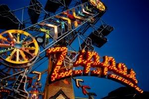
A well-know American tradition is the traveling carnival that passes through towns in the late summer, setting up stands for food, booths of arcade games, and sometimes larger rides like Ferris wheels, the Zipper, and the Octopus. These types of carnivals seem to be combining with theme parks and have evolved from what carnivals were thought to be when they first began traveling the U.S. in the 19th century, where “entertainment in rural America consisted of traveling circuses and burlesque troops, vaudeville and magic-lantern shows, all traversing the country by train or horse-and-buggy, offering temporary relief from the boredom of country life” (Traveling Circuses).

These types of traveling carnivals often featured performance by those with odd talents like sword-swallowing and ‘freak’ shows that put the strange and weird on display for the public. The people who signed up for these types of profession were not always the most quality or honest people and were often avoiding the law or had some other reason to not stay in one place. The combination of bizarre exhibits, strange people, and the supposed attitude of ‘anything goes’ created a reputation for the carnivals of a dirty, dangerous, and deceitful place of low morality. However, they still attracted crowds of people wherever they went, which proved it was still entertainment.

As the century turned, similar sorts of gathering of rides and exhibits were developing in what was known as amusement parks. The first of these appeared in Chicago in the 1890s, which was modeled after a mini-amusement park at the World’s Colombian Exposition, otherwise known as the Chicago World’s Fair (Amusement Parks). These types of gatherings were more geared to families and featured rides and booths for winning prizes and such, like Ferris wheels.

More recently, the carnivals that we see traveling the roads of America are more of a combination of the early carnivals and the later amusement parks. Magic shows are still common at these events but the country now frowns upon ‘freak’ shows; not because it is not what the wealthy people do but because it is immoral and against human rights. Now, carnivals are about the experience of adrenaline when riding on rides or winning a giant stuffed animal. They are about eating fried foods that you wouldn’t normally eat but you don’t care because it’s fun. These traveling carnivals are still not the cleanest places and the rides may not always be up to regulations but the people who attend these do not care very much about it.

The historical and cultural context of the background photo is important to the meaning of the comic because other than the words, that is all the observer has to interpret and ponder on. The reputation of carnivals as a place of entertainment and enjoyment outweighs the fact-to most people-that they are traveling sets of equipment that are not clean and the lifestyle brought about by gambling and eating fried foods is not optimal. The words of the comic are stating this but applying it in ‘grand scheme of things’ perspective: that you miss out on fun when you attempt to live cleanly and that you will end up in the same place anyway.

Works Cited:

Michael Baers "Traveling Carnivals". St. James Encyclopedia of Pop Culture. FindArticles.com. 21 Mar, 2010. http://findarticles.com/p/articles/mi_g1epc/is_tov/ai_2419101246/

Stan Barker "Amusement Parks". Encyclopedia of Chicago. Encyclopedia.ChicagoHistory.org. 21 Mar, 2010. http://www.encyclopedia.chicagohistory.org/pages/48.html

Wednesday, March 10, 2010

WP2: Pre-writing 1


(I'm having trouble figuring out how to get the image to the correct size, I've resized it in Photobucket but it doesn't seem to change the size of the photo once I upload it to the blog)

The image I have selected as a comic is called "I've been waiting" and is part of the A Softer World collection of images that are essentially photographs with typed writing somewhere over the photograph that are to be taken as a type of comic. The comics are designed by two people, Emily Horne and Joey Comeau, who work together to create comics that deliver many types of messages.

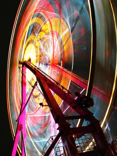
“I’ve been waiting” is comprised of three separate panels but is different from most comics because the background is all part of the same picture and is simply broken up by the space that is put between the three different frames. In paintings, this separating of a continuous image by framing or other separation is called a triptych, which I learned when analyzing a painting in the Slobodkina exhibit in the beginning of the semester. The background picture in this case is of a carnival ride in motion at night. It seems to me to be one of those rides that swing small carts of one or two people around, getting them higher and further away from the center as the ride goes faster. This kind of ride is called the Yo Yo. In the first panel, the type states “clean living is less fun” which is visually divided by two of the carts on the ride. The middle panel contains type that continues on with “and you wind up feeling stupid” in the middle of the panel. The last panel states “when you still die” in the lower half and the top half shows the middle lit-up framework of the ride.

As there are no people or characters in the comic, there is no interpersonal dialogue or interactions. However, the captions in each panel are to me a sort of dialogue between this somehow knowledgeable comic and the person who is reading the comic. One could perhaps assume the captions are the thoughts of someone who is riding the carnival ride but that was not my first impression.

The fact that there are no people to do the speaking of the text that appears in the comic is one of the ways that the “A Softer World” defies conventions that most comics follow. There is no introduction or storyline that all the comics follow specifically. This comic specifically is just stating some kind of observation about life with the goal of communicating this to someone else, but this person who is saying it is not known. Also, all of the type that is in each panel is part of the same sentence that just continues over the panels. This is not typical of a comic that has set speech bubbles (or some other sort of mode of separating text from the scene) because these usually have a continuing conversation but are logically organized into separate sentences.

The typography of the piece is very simple and is black writing with a small strip of white background in order to be able to actually see the writing on the background. The type reminds me of that of a typewriter and offers a simplicity that to me is indicative that all that is important is what the writing is saying, not what the writing looks like.

Saturday, March 6, 2010

Writing Project 1

Author's Statement

As this is the first writing project of this class and also my first project writing about analyzing a documentary photograph, I feel that I had some difficulties to overcome in preparing this piece. Our in-class work looking at other photographs and talking about them using language from the book and learning what exactly we were trying to do was very helpful. I feel that most of my issues stemmed from not understanding right away that we are not looking for something the photographer is trying to do and we are not looking for what its general meaning to the world is. Once I eventually grasped that we are looking for what the argument of the photograph is as it presents itself and just that, a photograph, analyzing the key technical elements that achieved the argument that I had already began to figure out became easier.

In my revisions, I wanted to figure out how to best arrange my points in the most logical manner that had the best flow. This included figuring out what points that I was making were the most important and also what would be the best understood after explaining others either before or afterwards.

In the introduction, I realized that some of my sentences were not in a very logical manner and tried to move from a general to a more specific information guideline when writing about the historical background of the photo. For example, I moved “The promise of a better life in America convinced many Europeans to emigrate from their dismal situations in their home countries” and “These groups moved to America for similar reasons that were tied to politics and economics” more to the beginning of the paragraph as so they would best follow the beginning sentence and then begin to introduce the two main groups of people and sharing their specific story by moving “Two major groups that were a part of this movement were emigrants from Italy and from Poland” after the two previous sentences.

I also changed the description of the photo and did not include anything about how they would be important for the argument, simply a brief description of the logistics of the photo. After that, I changed my thesis statement in order to match the new order of my points that I wanted to go in. Instead of arranging my points the first way in which I discussed the girl in the center of the photo first, I instead discussed the coloration of the photo because of its most importance. I re arranged the paragraphs so that they flowed in a more logical manner in the way that I went from coloration as the most important in general, the coloration of the signs, a paragraph about the coloration of the girl’s outfit and then her importance at the center, and then I ended the body with a paragraph about vectors of attention and how that related to my second point in the intro, that the photo depicts “the prospect of a promising future in the United States.”

I also changed a few small wording differences. For example, I tried to switch the word ‘like’ for ‘such as’ when giving examples of what I was saying. Other word choice changes were also made in order to sound more professional.

Rough Draft

Statement of Purpose

Writing Project 1

During the early twentieth century, the United States opened its arms to immigrants from all over the world. The promise of a better life in America convinced many Europeans to emigrate from their dismal situations in their home countries. These groups moved to America for similar reasons that were tied to politics and economics. Two major groups that were a part of this movement were emigrants from Italy and from Poland. After the reunification of Italy, the country was still left in poverty and opposing groups spread violence throughout the cities. Italians from all regions of Italy left the country with hopes for establishing a better life. Similarly, the people of Poland suffered from economic hardship, but they also suffered politically from the Soviet and German invasions. As with other Europeans, America’s promise for a better life rang in the ears of the battered Polish.

Upon arriving in the United States, immigrants were quick to set up their place in the new country, especially in the east coast because that was the most common arrival point for immigrant transportation. Neighborhoods that soon filled up with certain groups of people became known as “Little Italy” or “Little Poland” and such. Many immigrants worked as laborers in the many job forces that needed workers, or set up shops in big cities such as New York and other coastal cities. Along with setting up their economic role in society, the Italians and Polish also wanted to establish a cultural role in the United States; in a sense becoming American while still retaining their heritage and customs. The most important group that was affected by this was the children who were either very young when they came to the United States or who were born in the U.S. The children had to find a way to balance their inherited culture with the one that was presented to them in their daily lives. Most of these children attended American schools and learned English from an early age but spoke their mother language at home. Groups of differing ethnicities and backgrounds were also often intermingled in the cities in the schools because of their similar need to learn the language and the culture of the country they were growing up in.

One photographer, Fenno Jacobs, captured these aspects of immigrant life in America in the photo “Beecher Street School, whose student body consists of half Americans of Italian descent and half of Americans of Polish descent, Southington Connecticut. The Queen of the May was Emily Schwak, of Polish extraction; the King, Philip D’Agostino, of Italian.” The photo was taken in May of 1942, a time of great importance to the United States as a country and of a great deal of immigration to the country. The U.S. had been directly involved in World War II for a little over half a year after declaring war on Japan while poor conditions in European countries caused people to emigrate from their homeland to the United States, such as the Polish and Italians. The photograph shows Italian and Polish students attending a May Day festival. Some of the children are dressed in normal outfits and are holding signs with writing and pictures on them, and the girl in the center is sitting in a chair separated from the others and wearing a patriotic outfit. The photo demonstrates the assimilation of immigrant children into American culture in the 1940s and the prospect of a promising future in the United States. The photo uses pathos through logos in order to depict this. This is observed in the technical aspects of the aspects of coloration of brightness and saturation, focus on and framing of the girl in the center, and through vectors of attention.

The most important technical element of the photograph is the aspect of coloration because of the attention brought to the signs and outfit of the girl in the front. Overall, there are a broad range of hues in the photo in the children’s clothing, the signs, and the sky and ground. Many of these hues are also bright. These are the ones that stand out the most in contrast to the ones next to them such as the reds, whites, and blues that are, again, the patriotic colors of the U.S. These are present in the outfit of not only the girl in the foreground but also in the clothing of some of the other children. Also, the colors of the signs that bring attention to them are also fairly bright. These contrast to the darker shadows of the photograph around the areas of the children’s feet and the upper right-hand corner that has trees in the background. The most important aspect of the coloration is the saturation of certain colors that brings direct attention to them. This is most obvious in the signs that the girls are holding. One of the signs is for ‘breakfast’ and ‘lunch’ and is possibly and advertisement for something the school has. Even more so, the sign that is advertising Victory Gardens is the most noticeable due to the high saturation and brightness of the blues and yellows in the sign. This is significant due to the meaning of the sign. During WWII, the United States’ government asked its citizens to help the country out by growing Victory Gardens. The food from these gardens fed the communities so that the government could ration more food for the soldiers that were fighting overseas. These students, who are again of Italian or Polish descent, are holding up signs to advocate a very patriotic message, and this is a sign of their assimilation into the American culture.

Upon looking at the photo, the first person that is the most and first noticeable is the girl in the center. The most important aspect of her being the focus of the photo is the outfit that she is wearing. Everything is colored with blue, red, and white which are the well-known colors that together represent patriotism in America. As given by the photo title, one knows that she is not simply of American citizenship; she is of either Italian or Polish descent. These colors stir an automatic emotion in the hearts of most Americans because of their inherent meaning of pride and prosperity. This is an appeal to pathos in people who have been conditioned to feel this way. It is significant that a girl who is of foreign descent is now taking on these same emotions and meanings of these colors because it shows that she is becoming a part of the American culture that she is being raised in.

Another important characteristic that pertains to the girl in the center is the focus and framing that places her there. The girl is the most sharply detailed and focused on while the other students in the background are slightly blurry around their physical features. The girl is also placed in the center due to the framing by the edges of the photo. The other students are aligned in a way that there is no point or person that functions as a central one. Her presence in the foreground, in the otherwise empty space of gravel, also brings the first attention directly to her as opposed to the crowded background space that the students take up behind her.

Thirdly, the vectors of attention of the photograph also appeal to pathos in the form of creating a sense of excitement and anticipation. All of the students in the photograph are facing towards the left of the frame of the photo and by the description given in the title one knows that they are attending a celebration of the May Day crowning and their attention is on whatever part of that celebration is occurring at the moment. This brings about a feeling of excitement, which is also brought about by the combination of the aforementioned coloration and framing. The colors are all bright and stir not only feelings of patriotism but of the excitement of a new spring day. Also, the framing of the photograph does not capture all of the people in the crowd and so the observer is left to assume whether or not there is a large group of people. In large crowds who are all waiting for something to happen, there is often a feeling of excitement and anticipation. This can be taken as a way to look at how the country was feeling at a time of war-they were optimistic about where it was going because of the Victory Garden signs-and the way that immigrant men, women, and especially children, were feeling about their new life in the United States.

The technical aspects of coloration in terms of brightness and saturation, focus and framing of the girl in the center, and vectors of attention of all students in the photograph, all work together to form the pathos through logos argument that depicts two things. The first is the illustration of the assimilation of immigrant children into the American culture at an important time in United States' history. The aspect of coloration does this by bringing attention to the "Victory Garden" signs and the girl in the patriotic outfit; both represent a welcoming of the immigrant children into a new society. The focus and framing of the photo puts the girl in the patriotic outfit in the center, which again signifies the importance of her outfit and her attitude at the time of the photograph. The vectors of attention work to create the feeling of anticipation and excitement of not only the May Day festival but also the new life of the children in the new world. All of these technical elements are logical functions that serve to provide a pathos reaction in the observer of the photographer.

Monday, March 1, 2010

WP1: Rough Draft

During the early twentieth century, the United States opened its arms to immigrants from all over the world. Two major groups that were a part of this movement to the United States were emigrants from Italy and those from Poland. These groups were moving to America for similar reasons. The promise of a better life in America convinced many Europeans to emigrate from their dismal situations in their home countries. After the reunification of Italy, the country was still left in poverty and opposing groups spread violence throughout the cities. Italians from all regions of Italy left the country with hopes for establishing a better life. Similarly, the people of Poland suffered from economic hardship, but they also suffered politically from the Soviet and German invasions. Again, America’s promise for a better life rang in the ears of the battered Polish.

Upon arriving in the United States, immigrants were quick to set up their place in the country, especially in the east coast. Neighborhoods became known as “Little Italy” or “Little Poland” and such. Many immigrants worked as laborers in whatever job force they could find, or set up shops in big cities like New York and other coastal cities. Along with setting up their economic role in society, the Italians and Polish also wanted to establish a cultural role in the United States; in a sense becoming American while still retaining their heritage and customs. The most important group that was affected by this was the children who were very young when they came to the United States or who were born in the U.S. The children had to find a way to balance their inherited culture with the one that was presented to them in their daily lives. Most children attended American schools and learned English from an early age but spoke their mother language at home. Groups of differing ethnicities and backgrounds often were also intermingled in the cities and towns and also in the schools because they were all learning English and how to live in America at the same time.

Image, Source: digital file from original transparency

One photographer, Fenno Jacobs, captured these aspects of immigrant life in America in the photo “Beecher Street School, whose student body consists of half Americans of Italian descent and half of Americans of Polish descent, Southington Connecticut. The Queen of the May was Emily Schwak, of Polish extraction; the King, Philip D’Agostino, of Italian.” The photo was taken in May of 1942, a time of great importance to the United States as a country and of a great deal of immigration to the country. The U.S. had been directly involved in World War II for a little over half a year after declaring war on Japan. (Citation) Poor conditions in European countries caused people to emigrate from their homeland to the United States, such as the Polish and Italians. The photo shows Italian and Polish students at a May Day festival. Some are holding signs that are of importance to the argument of the photograph, and the girl in the center is dressed in a highly patriotic outfit, also of high importance. The photo demonstrates the assimilation of immigrant children into American culture in the 1940s and the prospect of a promising future in the United States. The photo uses pathos through logos in order to depict this. This is observed in the technical aspects of focus and framing of the girl in the center, the aspects of coloration of brightness and saturation, and through vectors of attention.

Upon looking at the photo, the first figure that is the most and first noticeable is the girl in the center. This is due to the focus and framing of the photograph. The girl is the most sharply detailed and focused on and is also in the center of the scene as framed by the edges of the photo. The other students in the background are more blurry and there is no one else who is centrally focused on. Her presence in the foreground, in the otherwise empty space of gravel, also brings the first attention directly to her. The most important aspect of her being the focus of the photo is the outfit that she is wearing. Everything is colored with blue, red, and white which are the well-known colors that together represent patriotism in America. As given by the photo title, one knows that she is not simply of American citizenship; she is of either Italian or Polish descent. These colors stir an automatic emotion in the hearts of most Americans because of their inherent meaning of pride and prosperity. This is an appeal to pathos in people who have been conditioned to feel this way. It is significant that a girl who is of foreign descent is now taking on these same emotions and meanings of these colors because it shows that she is becoming a part of the American culture that she is being raised in.

A second noticeable characteristic of the photograph is the aspect of coloration. Overall, there are a broad range of hues in the photo in the children’s clothing, the signs, and the sky and ground. Many of these hues are also bright. These are the ones that stand out the most in contrast to the ones next to them such as the reds, whites, and blues that are, again, the patriotic colors of the U.S. These are present in the outfit of not only the girl in the foreground as previously mentioned, but also in the clothing of some of the other children. Also, the colors of the signs that bring attention to them are also fairly bright. These contrast to the darker shadows of the photograph around the areas of the children’s feet and the upper right-hand corner that has trees in the background. The most important aspect of the coloration is the saturation of certain colors that brings direct attention to them. This is most obvious in the signs that the girls are holding. One of the signs is for ‘breakfast’ and ‘lunch’ and is possibly and advertisement for something the school has. Even more so, the sign that is advertising Victory Gardens is the most noticeable due to the high saturation and brightness of the blues and yellows in the sign. This is significant due to the meaning of the sign. During WWII, the United States’ government asked its citizens to help the country out by growing Victory Gardens. The food from these gardens fed the communities so that the government could ration more food for the soldiers that were fighting overseas. These students, who are again of Italian or Polish descent, are holding up signs to advocate a very patriotic message, and this is a sign of their assimilation into the American culture.

Victory Garden poster

Thirdly, the vectors of attention of the photograph also appeal to pathos in the form of creating a sense of excitement and anticipation. All of the students in the photograph are facing towards the left of the frame of the photo and by the description given in the title one knows that they are attending a celebration of the May Day crowning and their attention is on whatever part of that celebration is occurring at the moment. This brings about a feeling of excitement, which is also brought about by the combination of the aforementioned coloration and framing. The colors are all bright and stir not only feelings of patriotism but of the excitement of a new spring day. Also, the framing of the photograph does not capture all of the people in the crowd and so the observer is left to assume whether or not there is a large group of people. In large crowds who are all waiting for something to happen, there is often a feeling of excitement and anticipation. This can be taken as a way to look at how the country was feeling at a time of war-that they were optimistic about where it was going because of the Victory Garden signs-and the way that immigrant men, women, and especially children, were feeling about their new life in the United States.