(I'm having trouble figuring out how to get the image to the correct size, I've resized it in Photobucket but it doesn't seem to change the size of the photo once I upload it to the blog)
The image I have selected as a comic is called "I've been waiting" and is part of the A Softer World collection of images that are essentially photographs with typed writing somewhere over the photograph that are to be taken as a type of comic. The comics are designed by two people, Emily Horne and Joey Comeau, who work together to create comics that deliver many types of messages.
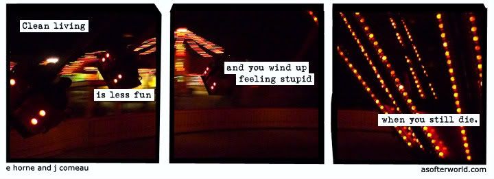
“I’ve been waiting” is comprised of three separate panels but is different from most comics because the background is all part of the same picture and is simply broken up by the space that is put between the three different frames. In paintings, this separating of a continuous image by framing or other separation is called a triptych, which I learned when analyzing a painting in the Slobodkina exhibit in the beginning of the semester. The background picture in this case is of a carnival ride in motion at night. It seems to me to be one of those rides that swing small carts of one or two people around, getting them higher and further away from the center as the ride goes faster. This kind of ride is called the Yo Yo. In the first panel, the type states “clean living is less fun” which is visually divided by two of the carts on the ride. The middle panel contains type that continues on with “and you wind up feeling stupid” in the middle of the panel. The last panel states “when you still die” in the lower half and the top half shows the middle lit-up framework of the ride.
As there are no people or characters in the comic, there is no interpersonal dialogue or interactions. However, the captions in each panel are to me a sort of dialogue between this somehow knowledgeable comic and the person who is reading the comic. One could perhaps assume the captions are the thoughts of someone who is riding the carnival ride but that was not my first impression.
The fact that there are no people to do the speaking of the text that appears in the comic is one of the ways that the “A Softer World” defies conventions that most comics follow. There is no introduction or storyline that all the comics follow specifically. This comic specifically is just stating some kind of observation about life with the goal of communicating this to someone else, but this person who is saying it is not known. Also, all of the type that is in each panel is part of the same sentence that just continues over the panels. This is not typical of a comic that has set speech bubbles (or some other sort of mode of separating text from the scene) because these usually have a continuing conversation but are logically organized into separate sentences.
The typography of the piece is very simple and is black writing with a small strip of white background in order to be able to actually see the writing on the background. The type reminds me of that of a typewriter and offers a simplicity that to me is indicative that all that is important is what the writing is saying, not what the writing looks like.